A header that survives the crop
Twitter Banner Size: Dimensions, Cropping and Free Templates
The recommended Twitter banner size is 1500 × 500 pixels, a 3:1 aspect ratio. X calls it a header photo; banner, header and cover image refer to the same space at the top of your profile. Those dimensions come directly from X's profile documentation.
The frustrating part is that an image can have exactly the right dimensions and still look wrong. A headline gets clipped, the profile photo covers a logo, or text that looked generous in the editor becomes tiny on a phone. Getting the canvas right is the easy part. The composition has to survive being displayed smaller and sometimes cropped.
Go to the crop guide, free templates, blurry-image fixes or export settings.
| Setting | Use this |
|---|---|
| Recommended canvas | 1500 pixels wide × 500 pixels tall |
| Aspect ratio | 3:1 |
| Practical export choice | PNG for typography and graphics; JPEG for photographs |
| Composition | Keep essential details away from the outer edges and the lower-left profile photo |
The canvas recommendation is X's specification. The export and composition choices are practical design advice, explained below. Don't confuse the banner with the separate profile photo, for which X recommends 400 × 400 pixels.
Why a correctly sized Twitter banner still gets cropped
X's upload troubleshooting page says different monitors and browsers can crop 60 pixels at the top and bottom of a recommended-size header. Treat those strips as expendable background. They are a reason to leave breathing room, not a promise that every device uses the same crop.
The profile photo creates a separate obstruction. Adobe's header guidance also calls out the lower-left overlap. A design that puts your company name along the bottom edge can lose its first few letters even when the rest of the image fits.
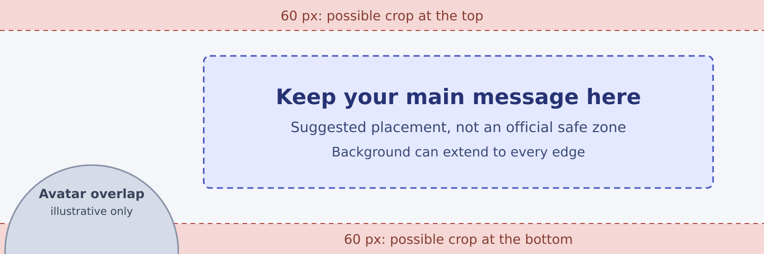
You may see templates described as having a universal Twitter banner “safe area.” Be careful with that claim. An exact rectangle can be useful in an editor without being an official guarantee of what every visitor will see.
In our guide, the suggested content box begins 400 pixels from the left and 110 pixels from the top, and measures 1000 × 260 pixels. It deliberately leaves generous space around the message. Use it as a starting point, then inspect your own profile. A face, product or illustration can sit elsewhere if losing part of it won't spoil the image.
Let color and decoration reach the edges. Keep the things someone must read farther inside. That gives the layout room to change without making the whole design look like a small rectangle floating in empty space.
Free Twitter banner templates, ready to customize
These two original layouts are 1500 × 500 pixels. Both leave the lower-left area free of essential copy and use a short headline rather than several lines of small print. Replace the example wording with something accurate for your account.
Download each editable SVG or PNG preview below. You can adapt the layouts for personal or business profiles without attribution.
A simple editorial header
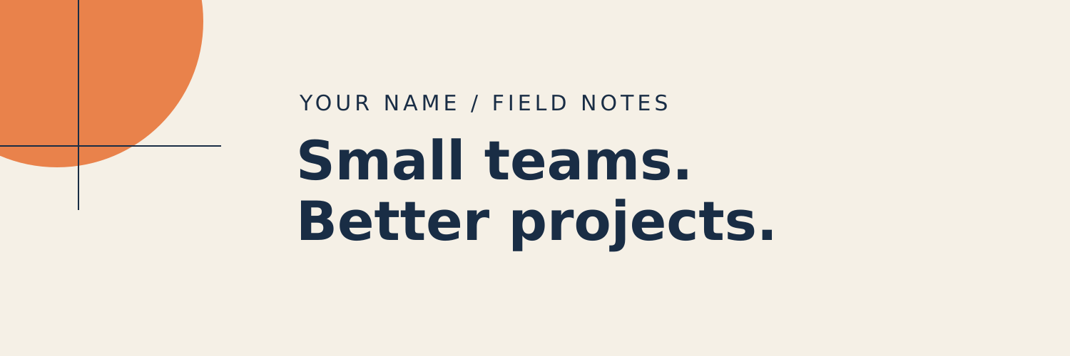

This suits a writer, consultant or founder with a recognizable subject. Keep the two-line headline short. The name is secondary because visitors already have your display name immediately below the banner. If your replacement headline needs four lines, edit the sentence before shrinking the type.
A studio or service header


The dark version works when the offer deserves most of the space. Replace “Your studio” and the sample headline, then adjust the accent color if needed. Resist adding six services, three badges and a booking address. The bio and website field can carry those details more usefully.
The SVG files are source artwork for a vector editor, not files to upload directly as X headers. Text and shapes remain separate in the source. Font substitution or an editor's import behavior can change the appearance, so inspect the result after editing and export a PNG or JPEG. The included PNGs are flattened previews, not editable text templates.
If you prefer starting in an online editor, Canva and Adobe Express both offer Twitter header templates. Check the canvas dimensions and move their text away from the avatar area. A pre-sized template still needs to fit your wording.
Design for the size people will actually see
A 1500-pixel canvas makes almost any headline look readable while you're working on it. The test is what happens when the whole image becomes much smaller.
For example, if a 1500-pixel-wide design is displayed at 375 pixels wide, everything is scaled to one quarter of its original size. Text drawn at 64 pixels becomes roughly 16 pixels high in that simplified example; a 24-pixel subtitle becomes roughly 6. These are scale calculations, not claims about a fixed X viewport.
Preview the complete banner at about phone width without zooming in. If the supporting line disappears, remove it or make it larger. The solution usually comes from saying less, rather than finding a different font.
A photograph needs the same discipline. Choose one with space around the subject. If a portrait is tightly framed, a wide header crop may leave only the eyes or cut off the chin. A wider environmental shot, with the subject away from the lower-left corner, gives you more room to work.
For a business account, decide what the banner adds to the rest of the profile. A ceramicist might show a row of finished work. A newsletter writer might name the subject. A software founder might show one understandable product detail. A screenshot of an entire dashboard is likely to turn into unreadable decoration.
Keep essential information in the bio or pinned post as well. Readers shouldn't have to decipher text inside an image to understand what you do. Our Twitter bio ideas give examples of making that explanation specific without making it long.
Crop to 3:1 before resizing
A common mistake is forcing a landscape photo into 1500 × 500 by changing its width and height independently. The file ends up with the right dimensions, but people and objects look stretched.
Take a 2400 × 1600 photograph as an example. At its full width, a 3:1 crop is 2400 × 800. Choose which 800-pixel-high strip contains the subject, then resize that crop to 1500 × 500. You're deciding what stays in the picture before reducing it.
If the crop removes something essential, change the composition. Place the photo on a wider background, use a different shot or make the subject smaller within the canvas. No resize setting can preserve all of a tall picture while also filling a wide rectangle without either cropping or distortion.
Keep an editable master. When you later change the headline, export from that master instead of adding text to a copy downloaded from your profile.
Why your Twitter banner looks blurry
First inspect the exported file before uploading it. If the text is already soft there, X isn't the first place the quality was lost.
Small source images are a frequent problem. Enlarging a tiny logo or a screenshot adds pixels, but doesn't recover the original detail. Use the original logo artwork where possible. Adobe's explanation of image resolution distinguishes changing pixel dimensions from simply changing the print-resolution setting: setting the same 1500 × 500 image to 300 PPI instead of 72 PPI doesn't make it sharper on screen.
Next look at the design itself. Thin strokes, tiny lettering and text over busy photographs can be technically sharp and still be difficult to read after reduction. Try a heavier font weight, fewer words or a plain panel behind the text before repeatedly increasing the export size.
Compare the saved profile with the local export at a similar displayed width. Comparing a full-size editor canvas with a small header tells you very little. If the local file looks good but the uploaded version doesn't, try a fresh export in the other static format and judge the actual result. There is no file type that guarantees X will leave the image untouched.
PNG, JPEG and the confusing file-size advice
For a mostly typographic design like the templates above, start with PNG. For a photograph, try a high-quality JPEG. As Adobe explains, PNG compression preserves the image data, while JPEG trades some data for a smaller file. Repeatedly saving an edited JPEG can introduce further losses. PNG's lossless export doesn't guarantee lossless processing by the destination platform.
For the upload itself, use a static image. X's profile guidance lists JPG, GIF and PNG and says animated GIFs aren't supported for profile or header images. Save animation for content that supports it.
You'll also find guides stating either a 2 MB or 5 MB header limit. The X troubleshooting page linked above specifies 2 MB for profile photos; it doesn't clearly establish a separate header maximum. Don't treat those two image slots as interchangeable.
A practical approach is to keep your header under 2 MB when that is easy to achieve, without presenting it as a verified universal header limit. These templates are well below that. For a large photo export, adjust JPEG quality and inspect the result rather than shrinking the canvas below the recommended dimensions just to reduce the file size.
Check the saved profile, not just the design file
Look at your finished profile on a phone and in a desktop browser. Check whether the avatar covers a meaningful detail, whether the headline can be read without enlarging the image and whether the banner still makes sense beside your bio. Use the saved profile for this check; the editor's preview isn't the final context.
A good banner makes a visit more useful. Getting the right people to visit is separate work. Relevant replies and useful posts give them a reason to look. If you're considering software for that organic approach, Fireply finds conversations through targeting and automates AI replies using a configured persona. It is paid software, not a follower package; X's automation rules, including recipient opt-in and prior written approval for AI reply bots, still apply.
Once the banner fits and communicates something worthwhile, leave it alone long enough to use the account. A clear headline and one strong image will do more for the profile than a week spent moving a decorative shape by three pixels.
Specifications and sources checked October 7, 2026. Canvas dimensions and cropping caveats are linked to X's documentation. Template layouts and suggested content placement are original design guidance, not official X device masks or measured growth results.